Let’s start with a brief review of the events that have taken place over the past month. On the American political front, 2021 began with the storming of Capitol Hill, which eventually led to the request for an impeachment trial of Donald Trump by the House of Representatives. Among these events, we should also mention the inauguration ceremony of Joe Biden, officially making him the 46th President of the United States. In addition, we now know that it is the Democrats who have control of the US Senate. Since there was an equal number of seats for the Democrats and the Republicans, it was Vice President Kamala Harris who broke the tie in favor of the Democratic Party.
Continuing in the field of American politics, the US government has generated a huge deficit since the start of the pandemic due to the introduction of numerous stimulus packages: $3,000 billion in March 2020, $900 billion in December 2020 and there is another amount of $1.900 billion currently in negotiations which would bring the total to $6.700 billion in new debt. Not to mention the additional debt taken on at the city and state level! For comparison purposes, the gross income of the US government in 2019 stood at $3.6 trillion, while expenditures amounted to $5.1 trillion and this is before the onset of the pandemic1! Imagine the impact on your family's finances if you already had a large deficit, your income was down, and you suddenly borrowed twice your salary for consumer expenses! Do you think your creditors would continue to charge you interest rates close to 0% indefinitely?
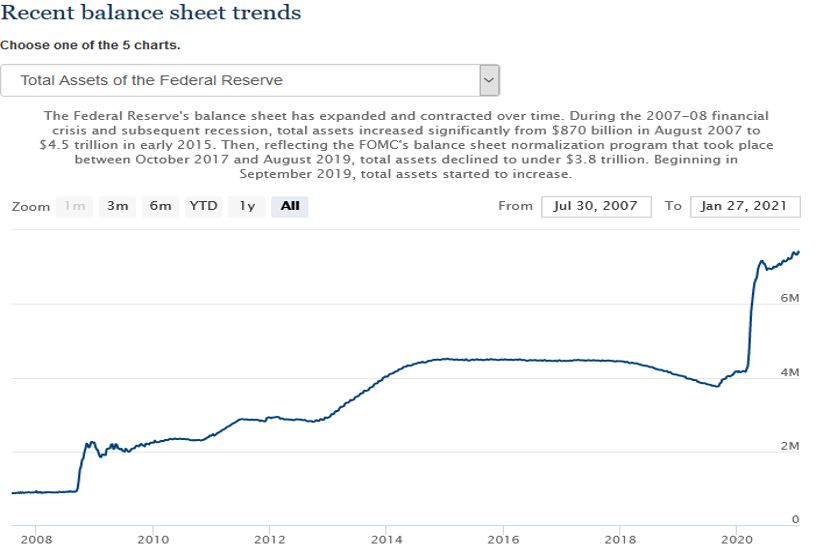
The central bank has not been idle since last March either! Indeed, it has injected nearly 3.2 trillion dollars into the financial system since March 2020.
Source : https://www.federalreserve.gov/monetarypolicy/bst_recenttrends.htm as of February 1, 2021
Together, the US government and the central bank injected nearly $10 trillion in 2020, which represents nearly 50% of all US gross domestic product. To those who are wondering why the stock market is also performing so well in such a dire economic context, you now have the answer!
Another story that tends to justify irrational movements caused by excess liquidity in stock markets is the one everyone is talking about these days: GameStop. For those who haven't followed the story closely, here's a quick recap. Gamestop is a retail chain specializing in the sale of video games. The company's revenues have been declining for years as young people are more likely to download their games directly with their game consoles rather than going to the store to buy them. Since the company's long-term outlook is not rosy, several hedge funds had large short positions on GameStop's stock. This strategy aims to profit from the fall in the share price and, conversely, would suffer from a rise. Although several factors led to the stock's surreal rise, going from $20 to $483 in a matter of days, representing a total valuation of almost $34 billion for a declining company, the most-mentioned reason in the media comes from an online community called "Wallstreetbets" on the "Reddit" blog. The six million members of this community have started a movement that has taken GameStop's share to an all-time high. Obviously, this spectacular increase caused losses to the tune of billions of dollars for the hedge funds which had bet on the fall of the title. Melvin Capital, being among the hedge funds that suffered the most, had to obtain financing from the Citadel and Point72 funds to ensure its survival. What you need to know is that Citadel is one of the largest clients of the US discount brokerage platform, Robinhood. So, when Robinhood told its users that they could no longer buy the titles from GameStop, it caused a stir.
To sum it up, we are witnessing a war between the big Wall Street players and the smaller investors in a context of excessive liquidity. Some have even drawn a parallel between the current situation and the Occupy Wall Street movement that took place in 2011. In all this frenzy, we believe that it will be all the more important to keep a cool head and maintain a disciplined approach to investing focused on a selection of quality companies generating good liquidity and having little debt.
Below are our findings for the month of January regarding the returns to be expected from fixed income investments and stocks.
Fixed-income investments
Here is a graph that shows the evolution of long-term interest rates over the years. It can easily be seen that interest rates are currently at a level well below their all-time high of 15.32% in the early 1980s. Long-term interest rates now stand at 0.93%, which represents an increase compared to 0.79% for the month of October 2020.
Interest rates – Long-term government bonds
Source : http://www.econ.yale.edu/~shiller/data.htm as of December 31, 2020
Now let's move on to provincial bonds. Here are the returns for a 1 to 10-year laddered bond portfolio. The yield decreased slightly from last month, from 0.97% to 0.86%.
| Provincial bonds yield-to-maturity | ||
|---|---|---|
| 1 year | 0.14% | Alberta 1.35% - September 1, 2021 |
| 2 years | 0.25% | Alberta 1.60% - September 1, 2022 |
| 3 years | 0.49% | Ontario 1.50% - September 8, 2023 |
| 4 years | 0.73% | Newfoundland 2.00% - April 17, 2024 |
| 5 years | 0.81% | Saskatchewan 1.80% - May 30, 2025 |
| 6 years | 0.94% | Ontario 0.00% - June 2, 2026 |
| 7 years | 1.06% | Quebec 1.00% - September 21, 2027 |
| 8 years | 1.17% | Quebec 1.40% - June 1,2028 |
| 9 years | 1.35% | Quebec 1.70% - June 1, 2029 |
| 10 years | 1.63% | Manitoba 1.70% - September 5, 2030 |
| Average: | 0.86% | |
Source : Factset as of January 25, 2021
So, again, we should expect a return of roughly 1% for the next several years from secure fixed income...
Stock market investments
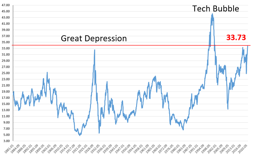
The price paid for publicly traded companies, according to the Shiller ratio, is currently at 33.73 times their profits. The ratio has increased since last month, when it stood at 31.96. This increase is directly linked to the rise of the S&P 500 index on the stock market without the profits of the companies that compose it following the same trend. According to this ratio, the market was only as expensive as in 1999 and is now more expensive than in 1929!
Price paid per one dollar of profit (Shiller PE ratio)
Source : http://www.econ.yale.edu/~shiller/data.htm as of December 31, 2020
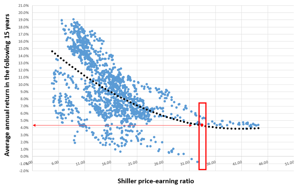
Let’s now take a look at the return achieved by investors during the 15 years that followed such a high valuation of the stock market in the past.
Shiller PE ratio vs. Average annual return in the following 15 years
Source : Factset as of December 31, 2020
So here are the results. On the horizontal axis, you can see different levels of Shiller's price-earnings ratio. It should be remembered that the higher the ratio, the more expensive the market is. The vertical axis represents the average annual return for the next 15 years. The blue dots represent all observed data and, finally, the black dotted line is the trendline of the graph. So, it is easy to see that the cheaper the market is considered, the higher the returns of the next 15 years, and vice versa.
If we take the current Shiller ratio which is currently at 33.73, we can see that the worst annual return for the next 15 years was close to -1%, while the best was around 5.5%. Based on the trendline, at the current ratio, we can expect an average annual return of a little bit above 4% over the next 15 years.
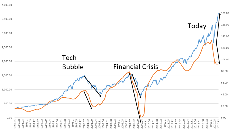
The following graph compares the price movement of the S&P 500 index with the earnings per share of the companies that make it up. Normally, it makes sense to observe a positive correlation between profit growth and market price. The more companies' profits increase, the more these companies increase in value and the more investors are willing to pay for them.
Price of S&P 500 index vs. Profits of S&P 500 companies
Source : http://www.econ.yale.edu/~shiller/data.htm as of December 31, 2020
We can observe that in each of the previous major crises, a decrease in profits (orange line) resulted in a decrease in the index price (blue line). During the tech bubble of the 2000s, the profits of the S&P 500 returned to their initial value after four years, while the index price took seven years before returning to the same level. As for the 2008 financial crisis, both profits and the price of the S&P 500 returned to their original values after about four years. In the current situation, we have seen a significant drop in profits since the start of the pandemic and the stock market experienced a marked drop in March in line with this decrease. However, unlike the last two crises, the S&P 500 has regained its value in just a few months and is now priced higher than before the decline! And this time around, this recovery is not accompanied by an equivalent rise in profits, far from it. It is likely that corporate profits will start to rise again, but it is unlikely that this rise will be fast enough to justify the increase in the stock market prices in recent months. Will the forthcoming fourth quarter 2020 results act as the trigger that will lead to a market correction? Only time will tell…
1 https://fiscal.treasury.gov/files/reports-statements/financial-report/2019/FR-02272020(Final).pdf
Disclaimer
Information in this article is from sources believed to be reliable; however, we cannot represent that it is accurate or complete. It is provided as a general source of information and should not be considered personal investment advice or solicitation to buy or sell securities. The views are those of the author, Marc-André Turcot, and not necessarily those of Raymond James Investment Counsel Ltd. Investors considering any investment strategy should consult with their investment advisor to ensure that it is suitable for the investor’s circumstances and risk tolerance before making any investment decision.
